Signs of the times
Mr Osborne will be giving his Comprehensive Spending Review today. For predictions on what massive cuts might mean for today’s UK design industry you might have to go elsewhere. Instead, we take a look back to a design success story born in the last Age of Austerity. Coming out of rationing, while Britain began rebuilding after the war, the Design Research Unit worked across architecture, graphic and product design.
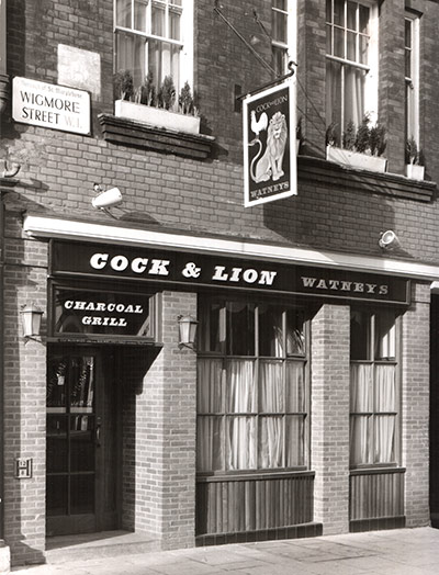
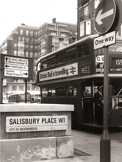
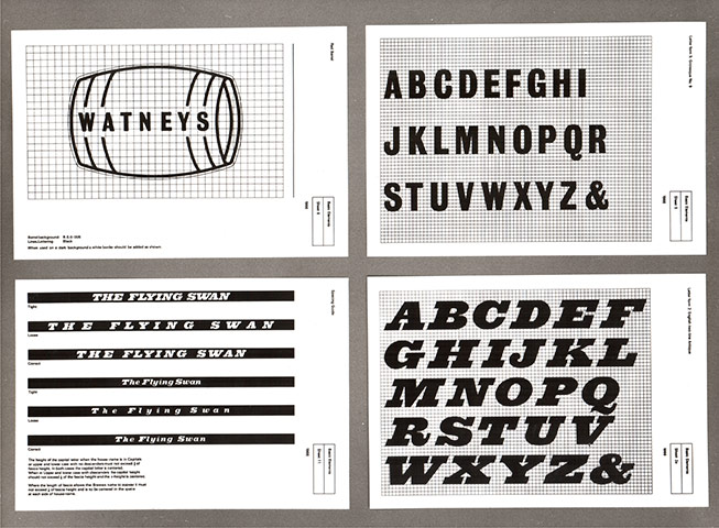
They created sharp modern fonts for Watney’s pubs – the kind of now-retro signage people dedicate blogs to cataloguing – as well as the British Rail logo and many London street signs.
For more go to this Guardian feature and photo gallery. And let’s hope a great new generation of lean, practical and ambitious designers are waiting to rise above the current economic turbulence. Via the medium of some rocking fonts.

Thank you SO, for that little batch of Font Porn. It has made a rainy wednesday all the more bearable!
Thanks – salute to a fellow font fan. x