Door update – is this oversharing?
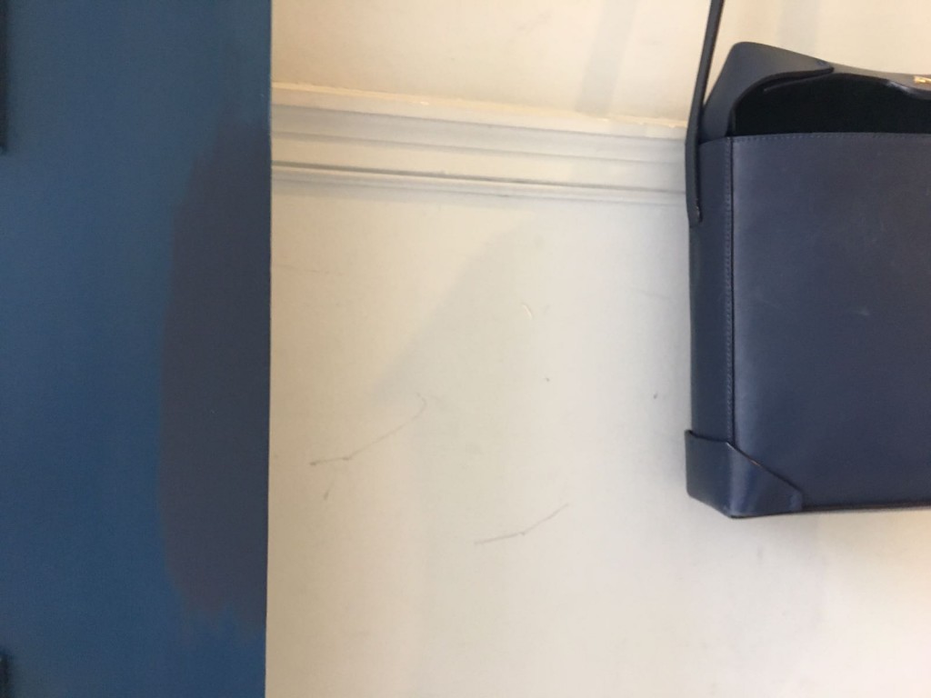
So I got the door back and it was totally the wrong blue. I was after navy blue, like my handbag and so I just spent a morning finding it in my local great paint shop (in West Norwood) to paint over the wrong blue.
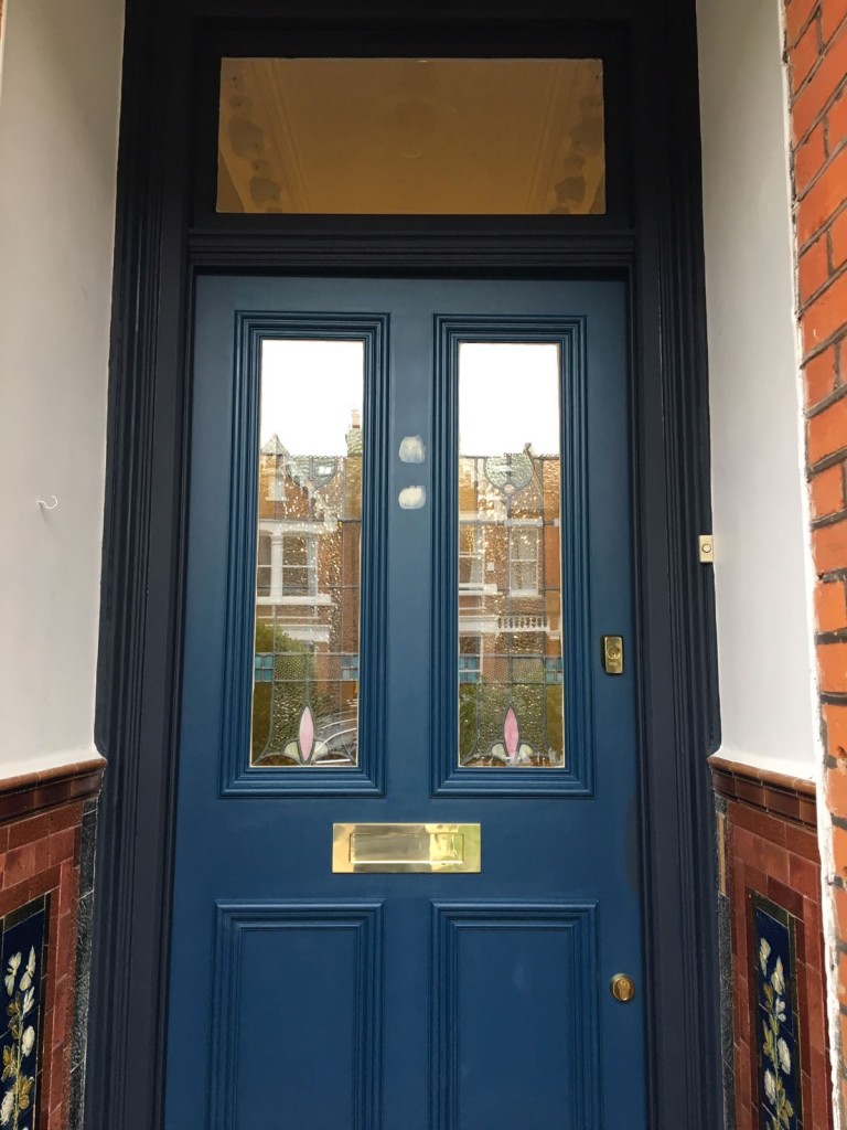
I have also realised that the brown fantasy will have to be shelved. Although I love it, it’s a colour too far for this tiny place. Here’s the frame painted in the right blue, alongside the door soon to be repainted in the same colour.
And here’s me trying to convince myself that I’m still going with the baby poo colour on the walls.
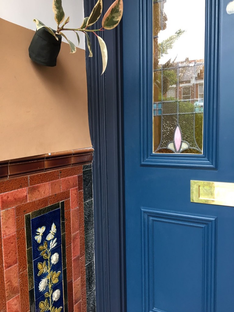
Don’t worry, I’ve got another potential home for it. That’s also a stunt plant, but I do plan on having a plant in the doorway which I’m imagining will lend a real classy air to the whole thing.
Long story short the whole porch is going to go navy and I think it’ll be cool. I loved your honest replies before so knock yourself out and comment again if you fancy it. I think I can take it.


I really like both blues, the lighter one, my mother would call French Navy, and as she had a French Navy suit in the 50s with a nipped in waist and matching platform shoes with contrasting cerise pink elbow length gloves, I bow to her colour naming expertise. The darker one is a better fit for you tiles and and the frame looks lovely too. Mmmm yes we can all get a bit opinionated can’t we. Xxxx
Love the blue framing (not the door blue) and if you go all blue think will look great but I actually like the brown !!!
Sent it too soon !
Well, who am I to say I told you so?
But I told you so 😉
Neither of those blues is a Navy blue.
Both are too light. My sense of a Navy blue is the colour of uniform Prince Philip wears on the balcony while standing next to the Mrs – very nearly, almost black – to me that’s Navy blue.
If you’ve got white window frames then I would go back to the white door frame you had before and a much darker/truer Navy blue.
Just put the brown tiles out of your mind – they’re a quirky novelty and don’t need to match with anything.
Also, they’re not seen until a visitor is ‘in’ the vestibule, so effectively invisible to the front elevation.
I feel your pain. So many jobs started that had been better unstarted
No it’s not oversharing… keep the paint updates coming. X
What if instead of the brown you have chosen, try one with a bit more of a rust colour? I don’t think that the one you have chosen has the right undertone. It seems to have more of a green undertone as opposed to a red undertone. I mentioned before that i also think that the wall would look fantastic if you pulled the yellow out of the tile and used it on the wall. Mustard yellow and navy blue look fantastic together and it looks great with brown too.
I think Anne has a good point. Door and surround both the surround blue, and you might like the gold/yellow of the flower in the porch on the walls above. It would look good with the blue… but maybe not a very strong yellow, more a soft gold? It’s a big improvement anyway!
I love these posts, so keep ’em coming.
The darker blue is going to look fantastic and it looks very smart with the door frame painted that color, as well. I agree with Anne, perhaps if you went with a richer shade of brown or even mustard as she suggested. I’m one of those crazy folk who actually likes brown! If done properly it’s lovely. Anywho, can’t wait to see the finished product!