Shopping

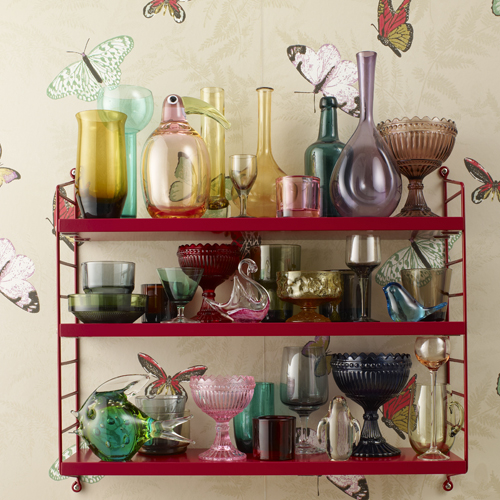
To thine own shelf be true

I have just seen these lovely pictures, featuring a delicious stew of some of my favourite things – loud wallpaper, clashing/composed colours, nick-nacks and – er – shelving. This String Pocket shelving system was originally designed in 1949 by Nils Strinning, and is available now at Utility Design. Each shot seems styled with a different personality type […]

Potato prints

Just seen this lovely new London poster made for Pedlars. I thought I was over the whole London interiors thing (Union Jacks, tube signs, Gherkin-embroidered cushions, etc), but I love the style of Jim Datz’s illustration – it’s reminds of me that Mr Rossi cartoon that always used be on over Easter. This lead me […]

Neisha Crosland all over

We’ve both got the wallpapers, My Friend even has a top and a scarf, and now it’s time for the tiles. Yes, Neisha Crosland has just made me want to tear out the year-old tiles in my bathroom so I can start again with some of these.  My Friend, fancy dressing up in said top […]

Colour clash conundrum

Can’t decide if I love the clashing colour combo of this new limited edition Pumpkin armchair, or if the red one looks too much like a cat’s ass. Maybe I love it either way. Thoughts?

Two kitchen contemplations

Yes, although my new kitchen is a long way off, I can’t help my mind a-wandering to what I might do. OK, I’ve made a list of the tiles, wallpaper etc of my choosing in a little book. The kind of kitchen I’m pondering is, in a word, yellow. So I thrilled to this example, […]