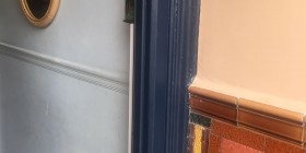
Collar and cuffs
The following is not breaking news. However, a trusty friend recently put a good name to it so I’m reporting on it. Collar and Cuffs is a decorating faux pas that requires you to picture one of those ghastly coloured gent’s shirts that has white collars and cuffs. Refer to an old episode of The Apprentice (any) if you’ve been spared this fashion delight. In decorating terms, it’s when you’ve painted your walls a deep colour – most likely grey – but left the skirting boards and the band above the dado rail dazzling white. Behold my Living room skirting boards as a shining example of how to avoid C&C.

Yes, eagle-eyed readers the band above my dado rail is indeed white, but I think it works in this instance because of the white half of the room – and because it’s not a top-and-tail situation. The real crime can be found in my bedroom…

There has been no daylight in London today, so I’m using existing pics to illustrate the point not very clearly. Hear me now, the white area between wallpaper / colour and ceiling is VERY ANNOYING. My thoughts are this: Paint the skirtings the same grey as the walls, then the area above (including dado) a lighter shade of grey. Then, paint the skirting below the wallpaper a matching dusty pink and apply the same paint (or lighter) or leftover wallpaper to take it up to the ceiling. You with me?
For the record I think white skirtings and above dado is often perfectly fine. But here are some pics of familiar C&C-free zones that are urging me to take action…


Sorry to say I have collars and cuffs everywhere in my very grey house. I like the way the white makes the grey stand out even more and everything looks sharper and clearer. Kind of …
Ummmm I have collars and cuffs but mine is stripped wood to blend with the floor. I also have picture rails and dado rails but always paint in matt silk not the naff 80s style of high gloss white. Do you think leaving the C&C off it gives the room grander proportions? I wanted mine to extend the eye up from the floor and added extra height to the skirting boards. See pics, what do you think?
http://www.vicbackside.blogspot.com
Excuse the finish as I am not yet finished yet only completed building just before Christmas and need to make adjustments to the curtain length in the bay [big sofa covered the bottom previously!
I can go one better – our conservatory still contains one completely unpainted skirting board – from the previous owner’s half-hearted DIY job before we moved in (3 and a half years ago!)
Your home is stunning, I wouldn’t worry too much!
Thank you! 14 weeks of blood sweat and tears after living here for 4 years it was time….
Pat you have a point, Binky the white does help with proportions so I think that will work well and Julie B the chances of me getting around to action are slim so thanks for the encouraging words.
I think those dark skirting boards look great, especially grey. i have seen this done in a lot of houses for sale, and I’d like to use grey for all the skirtings when I repaint my new house. It will not show scuffs like white does, and should look good for much longer. Do you recall which shade you used in the first photo?
Hi Flora, yes it’s actually a dark green colour, Castle Gray from Farrow & Ball, and you’re right, it hides everything.